

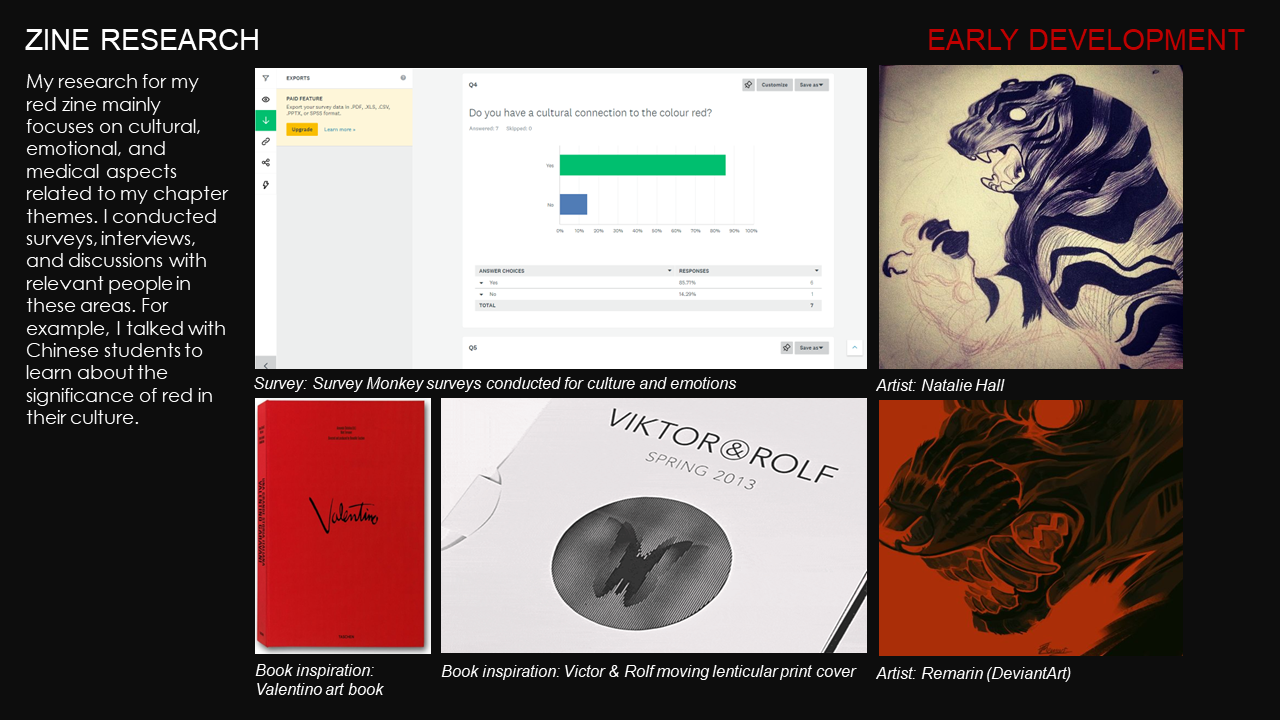
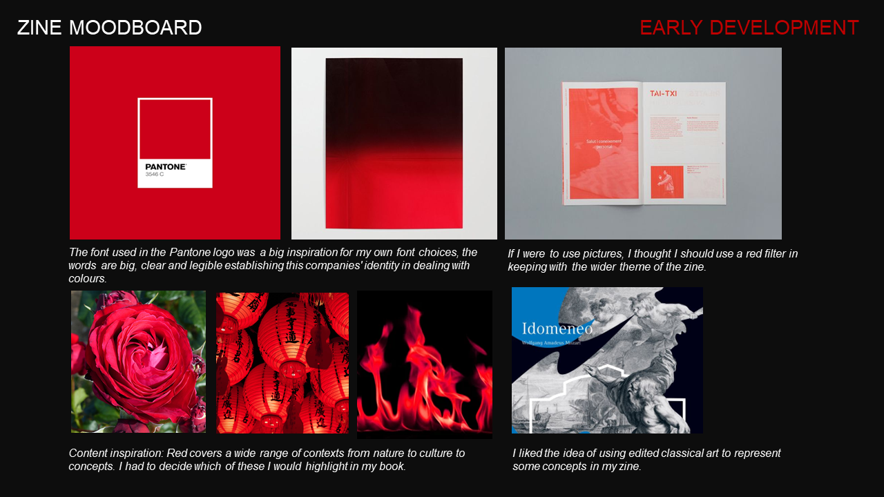
Seeing Red Zine
Seeing Red is an experimental, limited-edition zine developed during my MA in Graphic Design. Utilising the "handmade" brief as a site for technical and conceptual risk-taking, the project investigates the intersection of photography, illustration, and lenticular printing within contemporary publication design.
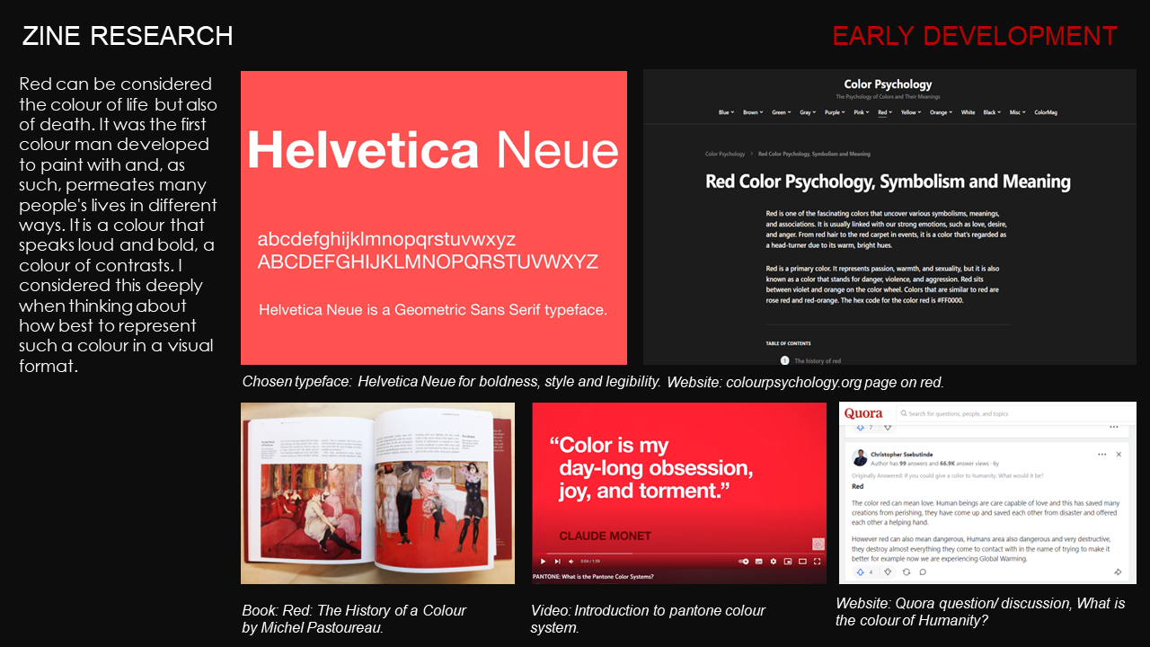
The inquiry centres on the semiotic versatility of the colour red. By navigating its associations with biological commonalities such as blood and emotional extremes like love and aggression, the work frames red as a universal signifier of the human condition. Aimed at an audience interested in the convergence of colour theory, culture, and philosophy, Seeing Red challenges the reader to move beyond surface-level aesthetics and engage with the visceral, multifaceted nature of visual perception.
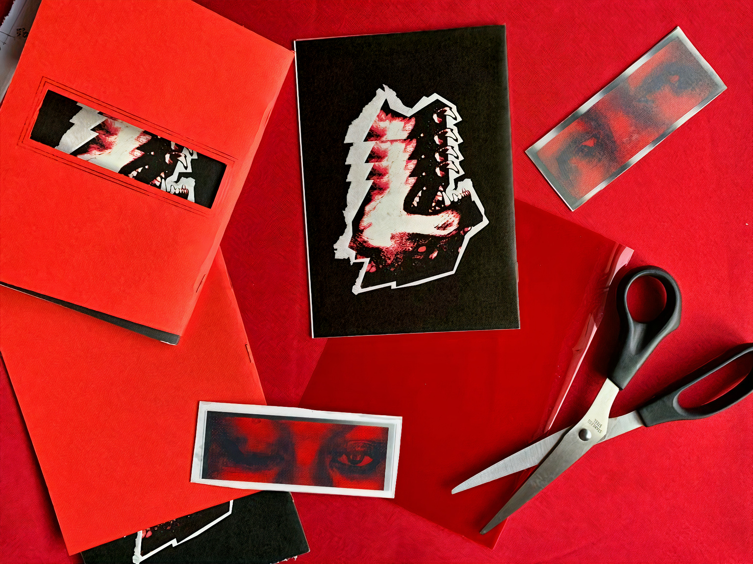
Specifications: 32pp, saddle-stitch bound, custom dimensions (W 13.1cm x H 18.8cm).
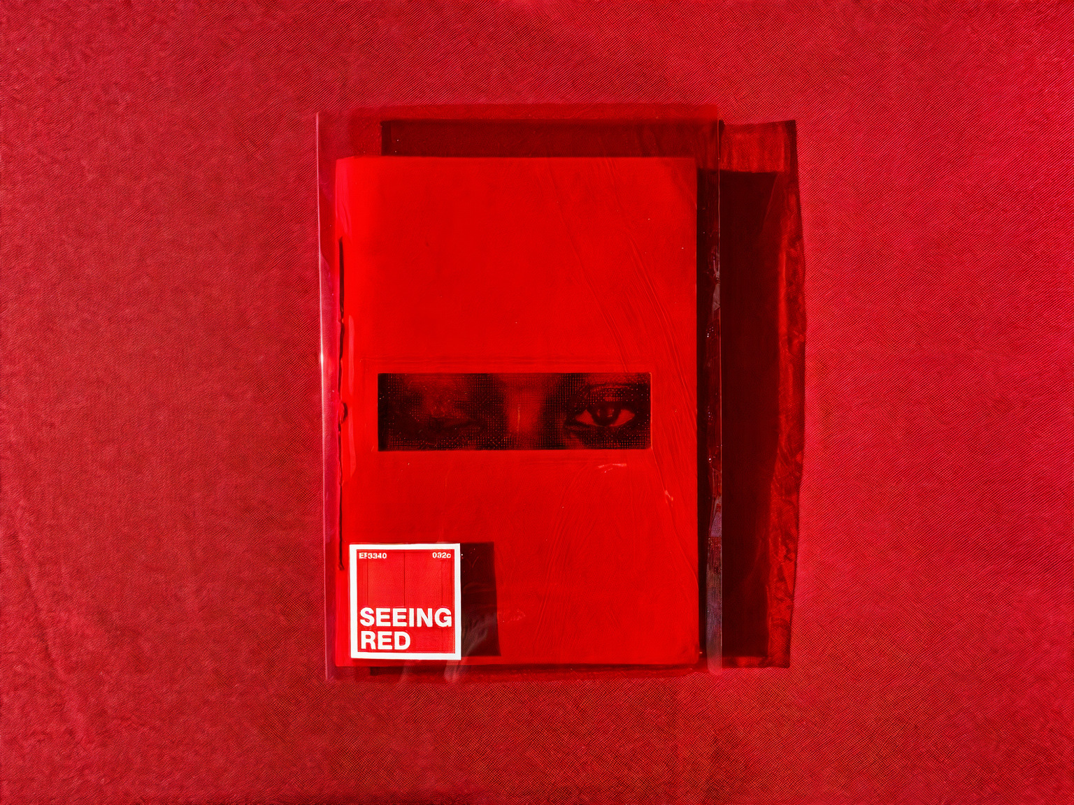
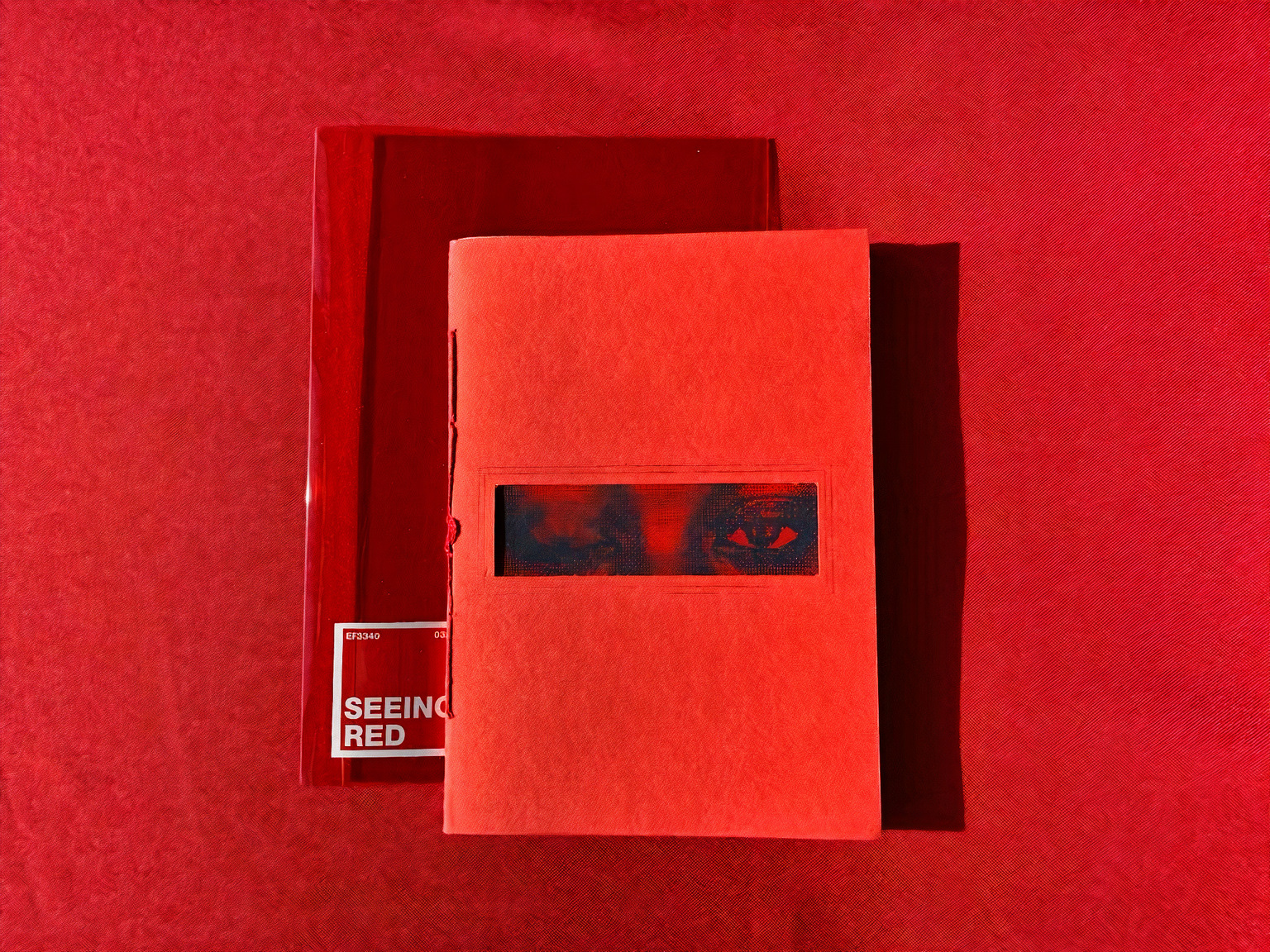
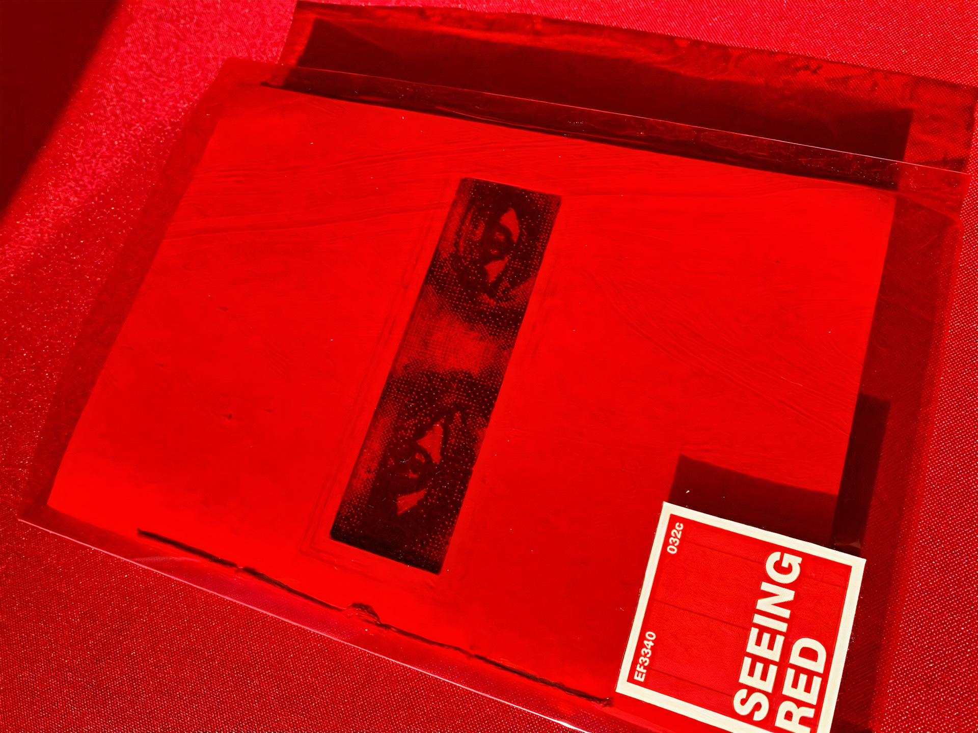
The materiality of the publication is central to its conceptual delivery. The outer enclosure features a red acetate dust jacket, which serves as a literal and metaphorical lens for the content within. The cover is constructed from G.F. Smith Colorplan (Bright Red), paired with Mohawk Superfine for the interior pages to ensure a premium tactile experience.
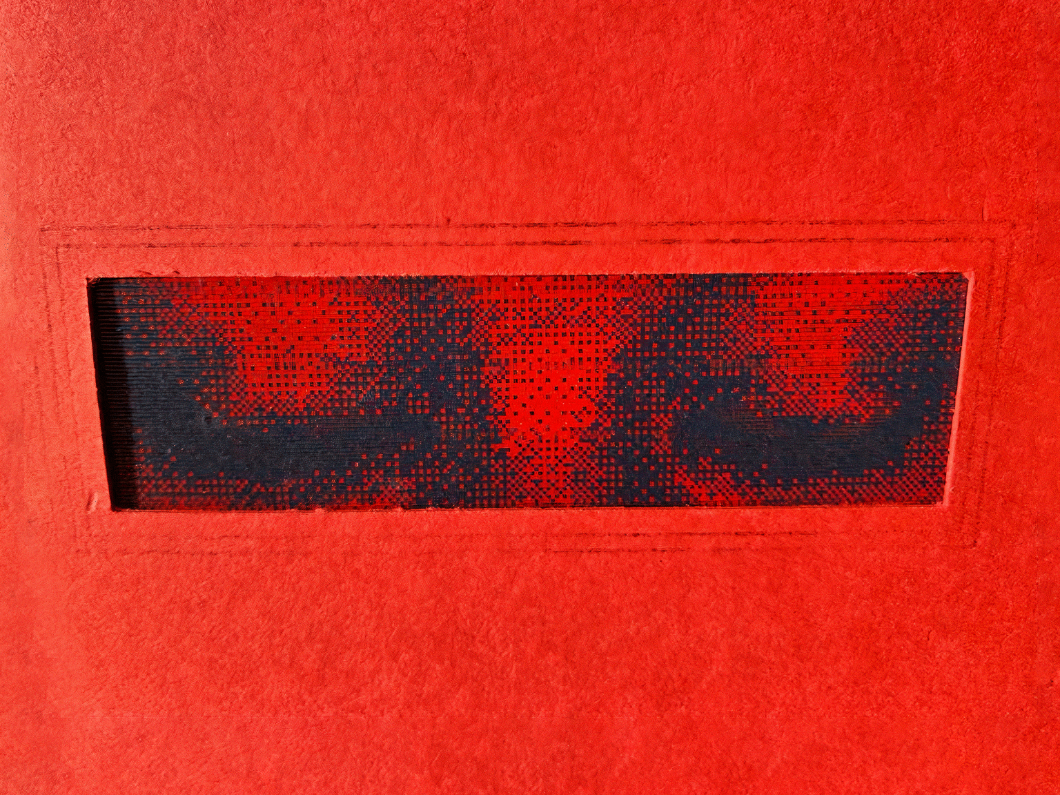
A focal point of the zine is the integrated lenticular print, produced using high-gloss photographic media and a 50 LPI (lines per inch) lenticular lens to facilitate a shifting, kinetic perspective. Structurally, the zine curates a collection of articles and poetry that investigate the multifaceted symbolism of red, grounding the experimental production in a rigorous thematic narrative.
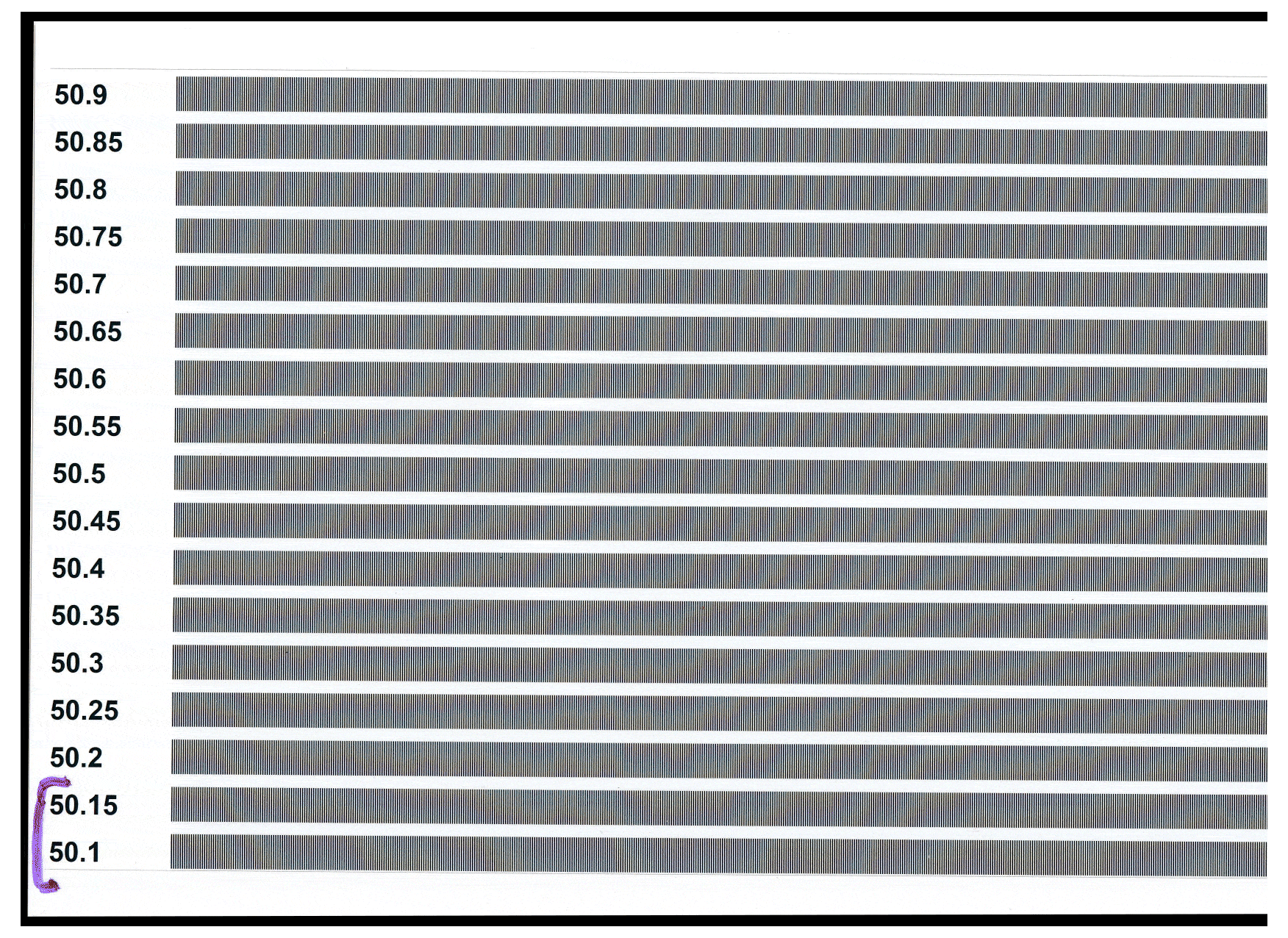
Pitch test sheets for lenticular printing.
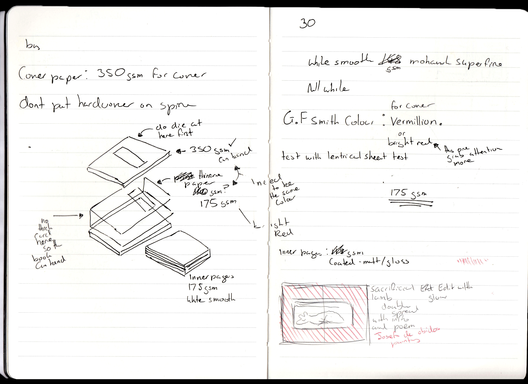
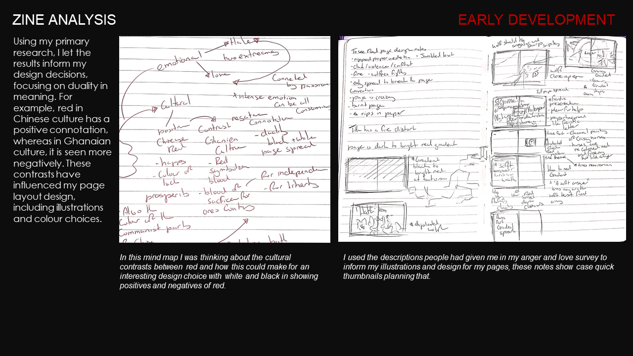
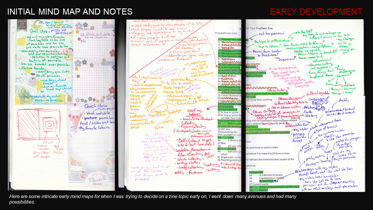
Scans of some of the pages of my notebook for the project
Achieving the necessary precision for the lenticular effect required a rigorous pitch-testing phase. This technical calibration process involves aligning the digital interlacing of the image with the specific physical frequency of the lenticular lens to ensure seamless optical motion.
While this required a high degree of iterative testing and printer calibration, the result was a flawless integration of kinetic elements into the publication.
Drawing on my background in animation, I sought to translate the principles of temporal motion into the static medium of print. I achieved this through a series of self-directed lenticular printing experiments, successfully bridging the gap between moving image and physical publication.
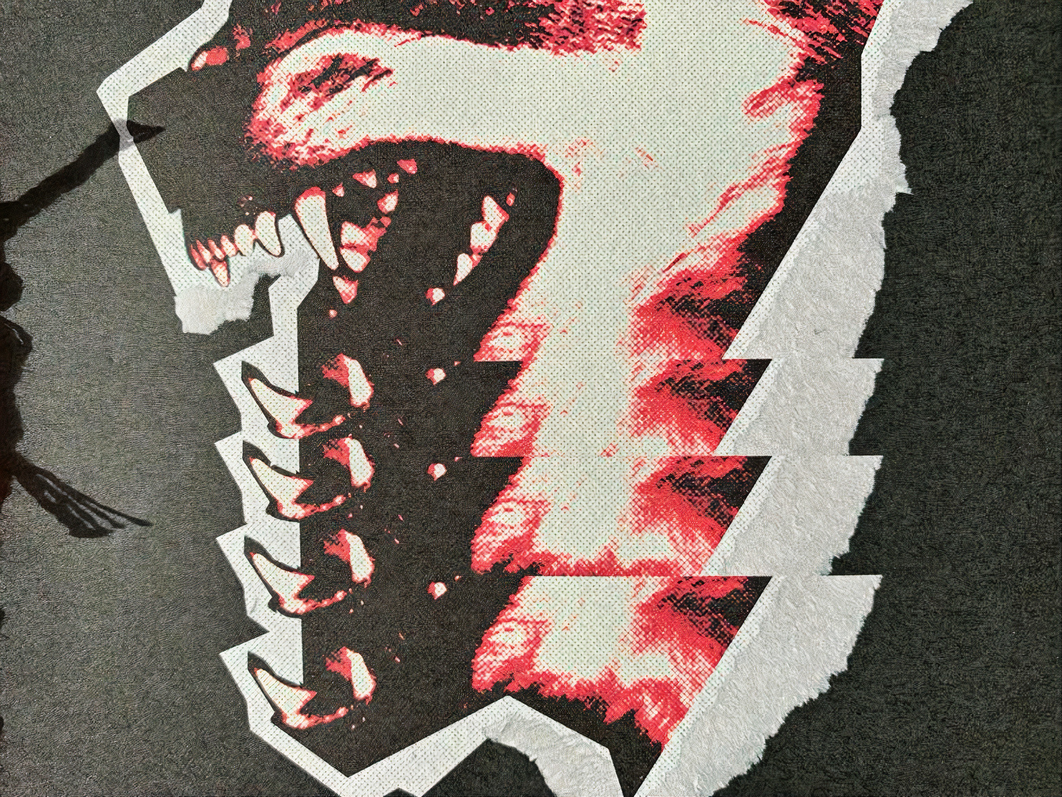
To enhance the tactile, analogue quality of the work, I applied a bitmap effect to the "eye" imagery. This intentional manipulation of the digital grain not only references the legacy of print ephemera but also creates a deliberate tension between modern digital tools and the raw, visceral textures of the human form.
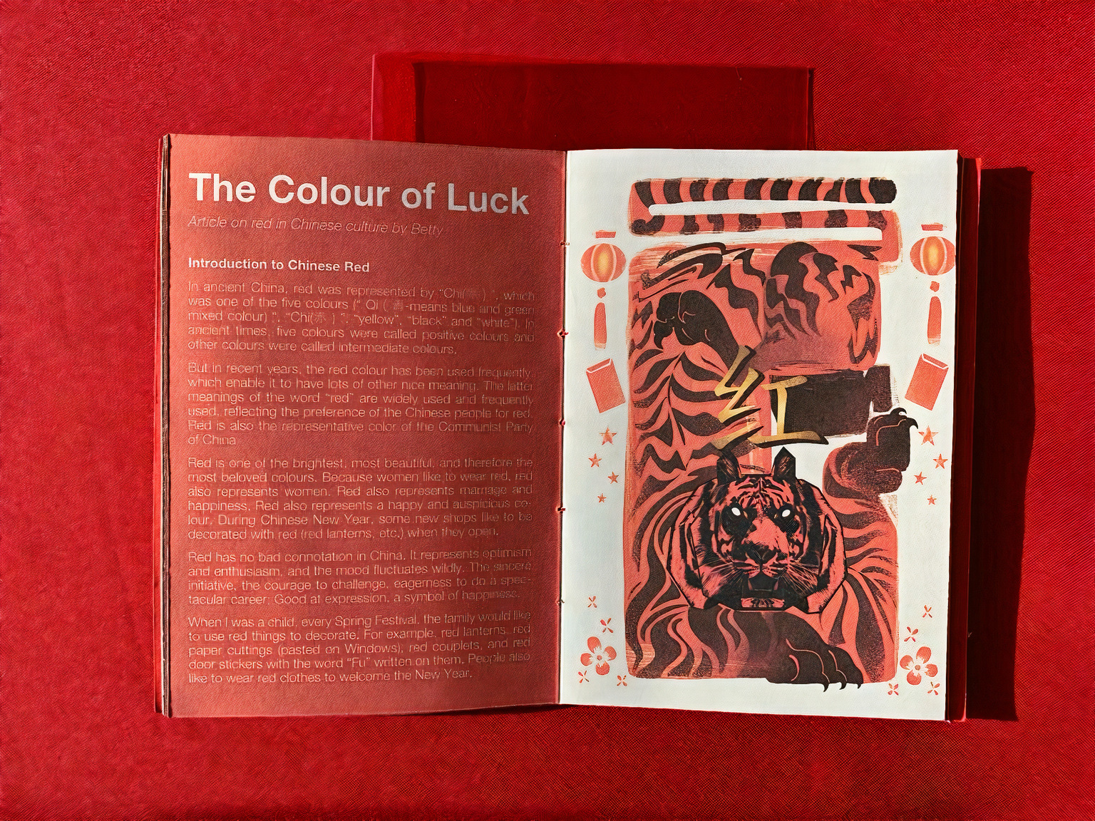
To ground the publication in a global context, I utilised a collaborative curation model, inviting classmates from diverse cultural backgrounds to contribute their unique perspectives on the symbolism of red. For instance, rather than providing an external analysis of the colour’s association with luck and vitality in Chinese culture, I prioritised primary narratives, allowing contributors to define these meanings in their own words. This approach ensures that the zine functions as a platform for authentic voice rather than a singular interpretation.
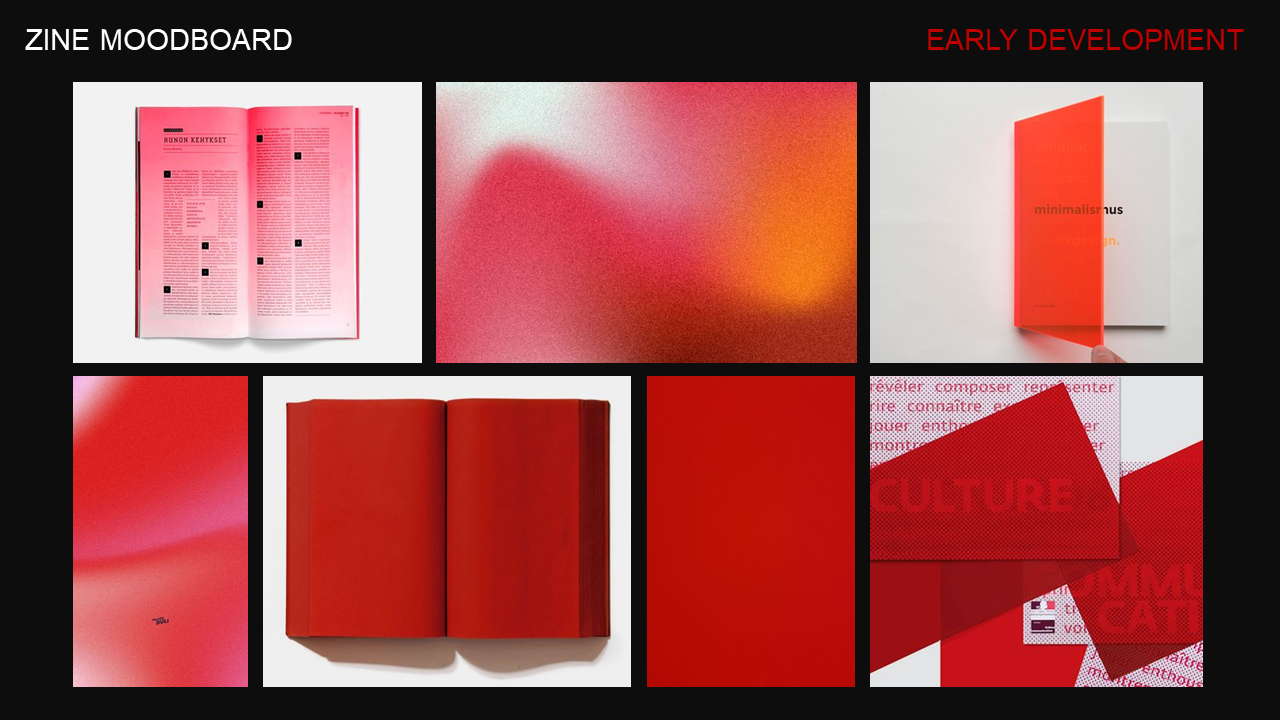
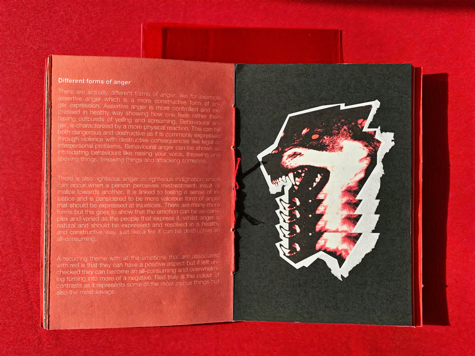
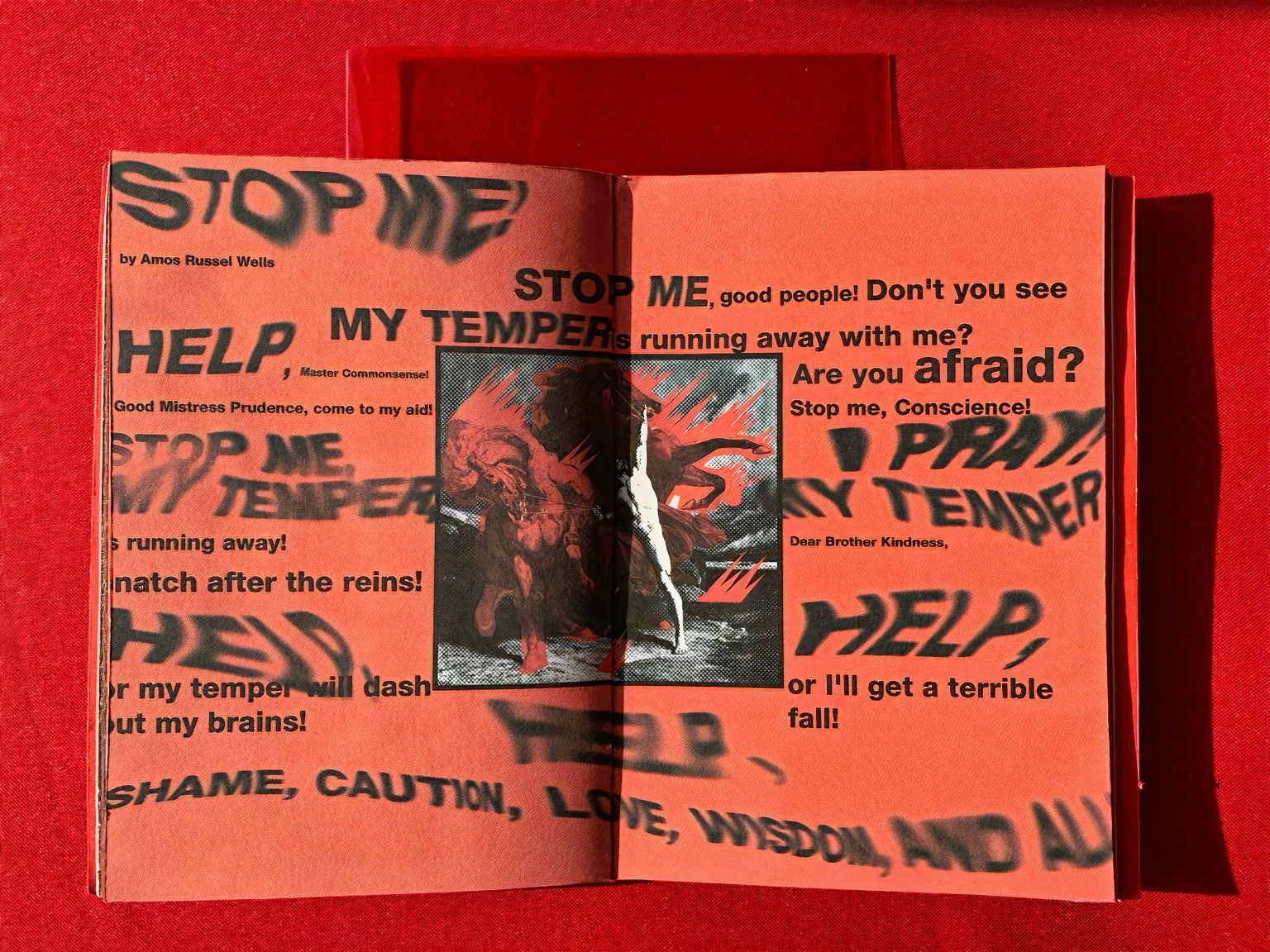
To maintain a high level of visual cohesion across these varying perspectives, I implemented a disciplined, high-contrast palette of red, white, and black. This minimalist colour strategy allows the multifaceted written content and complex material textures to remain the focal point, ensuring the "visual noise" is minimised while the cultural resonance is maximised.
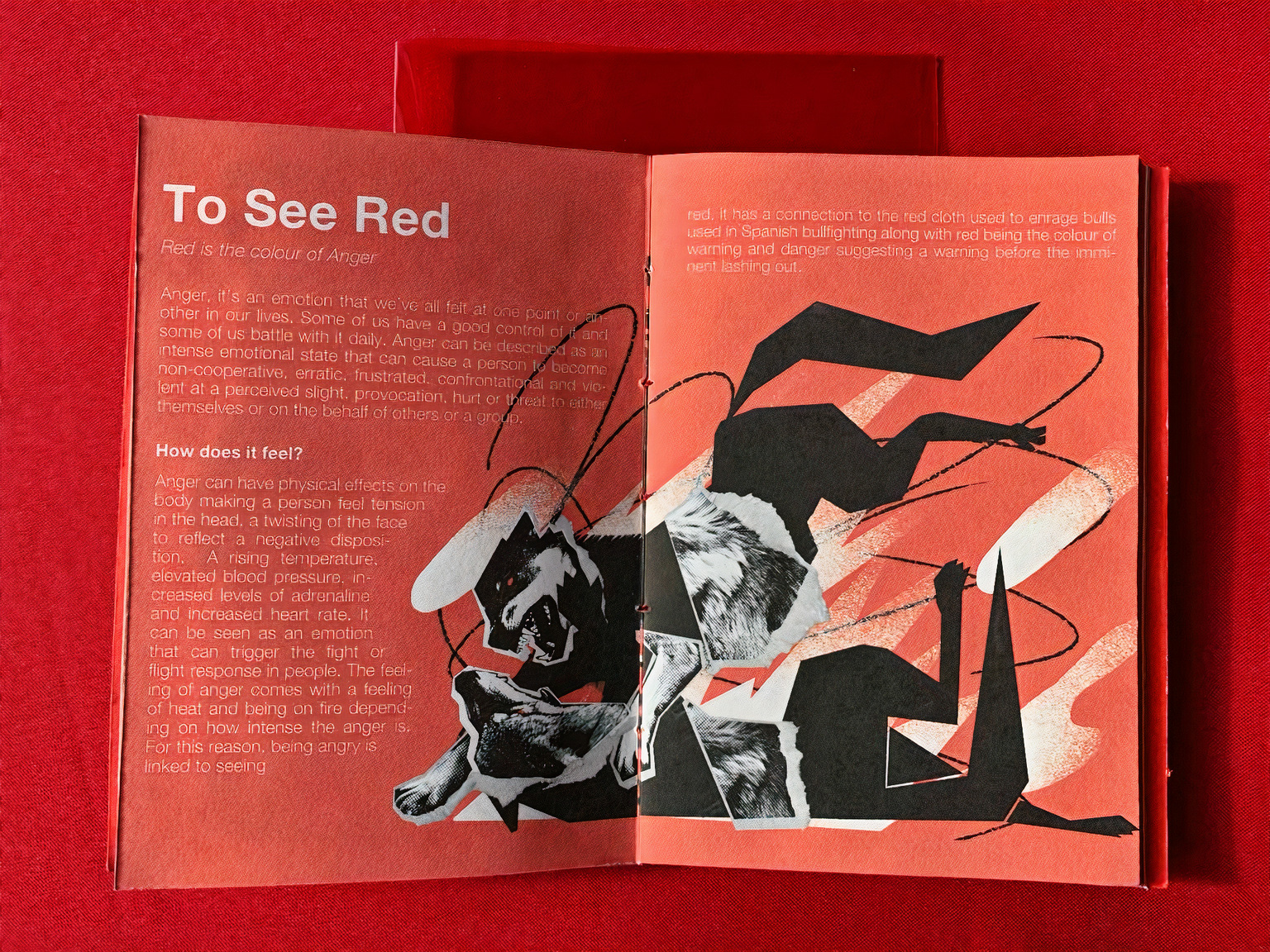
The combination of hand-drawn illustration and photography presented with a halftone effect style served as a way to communicate the duality of the colour by the juxtaposition of the two styles. The heavy editing collage style of the photographs gives the work an abstract feel to correlate to the abstract nature of the colour. The animals in the illustrations serve as symbolic motifs to communicate the emotion or theme being spoken about on the page.
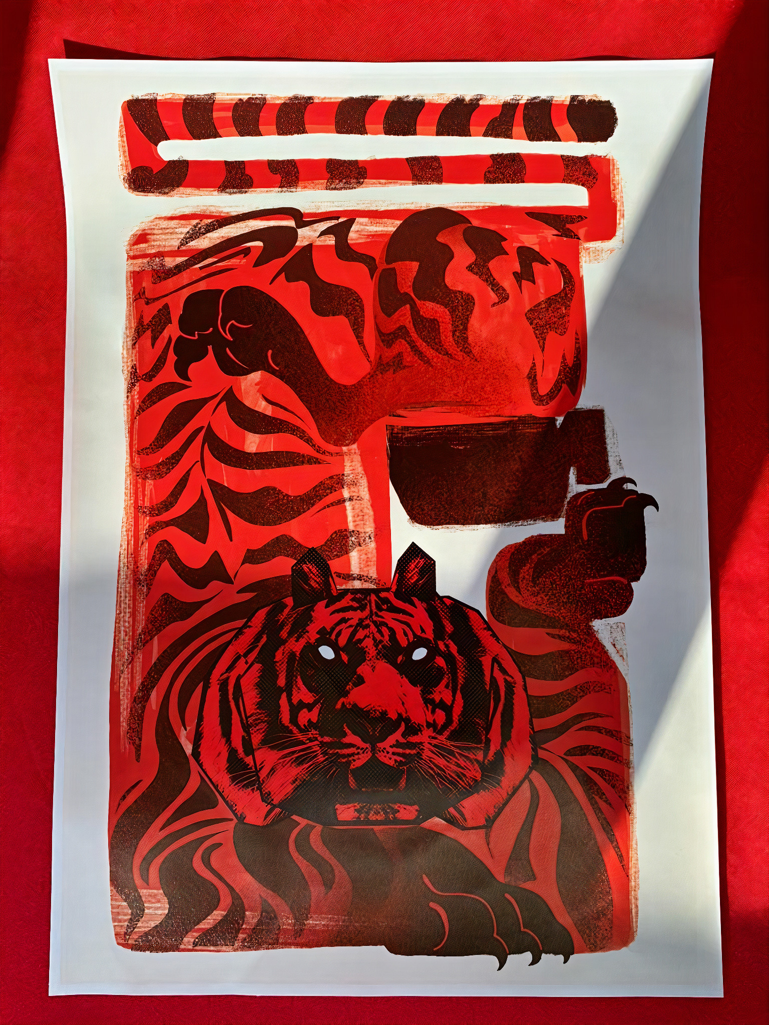
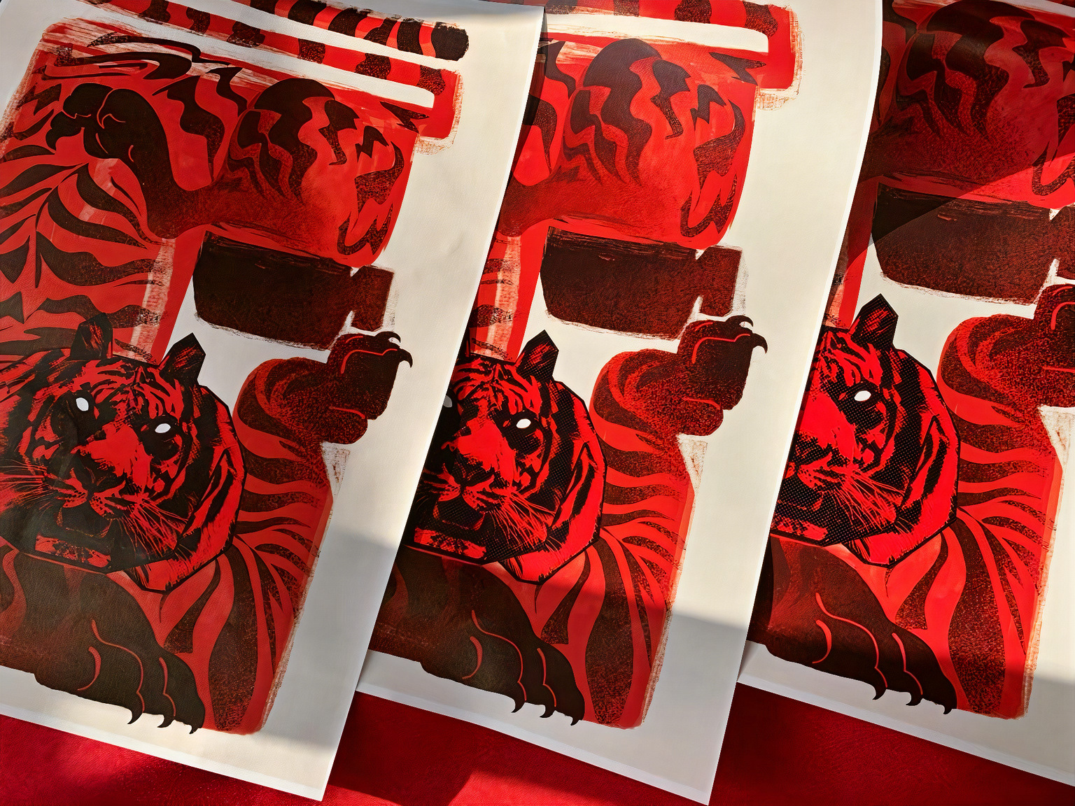
In addition to the publication, I produced a series of companion posters to extend the project’s visual narrative. These large-format prints leveraged the raw, analogue textures of the original illustrations, translating the visceral energy of the zine into a broader environmental context.
The final result is a visually striking object that embodies the multifaceted nature of its subject matter. Seeing Red served as a vital site for experimental autonomy, allowing me to push the boundaries of bookbinding, material science, and print media. While zines are frequently viewed through a commercial lens, this project was prioritised as a space for rigorous technical inquiry. The process was a deeply enriching experience that expanded my methodological toolkit and established new ways of working that now anchor my broader research-led practice.